| END-TO-END APPLICATION
CONSYNC
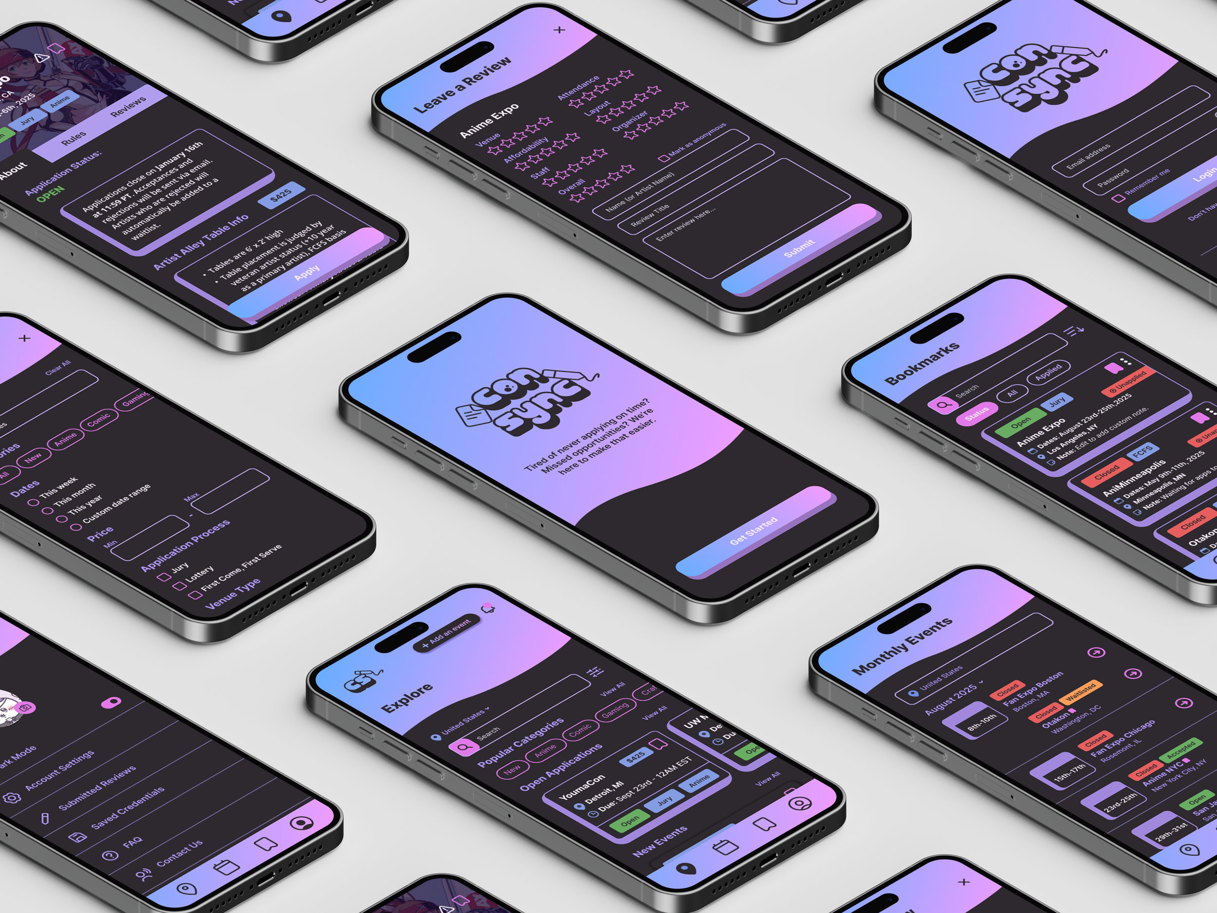
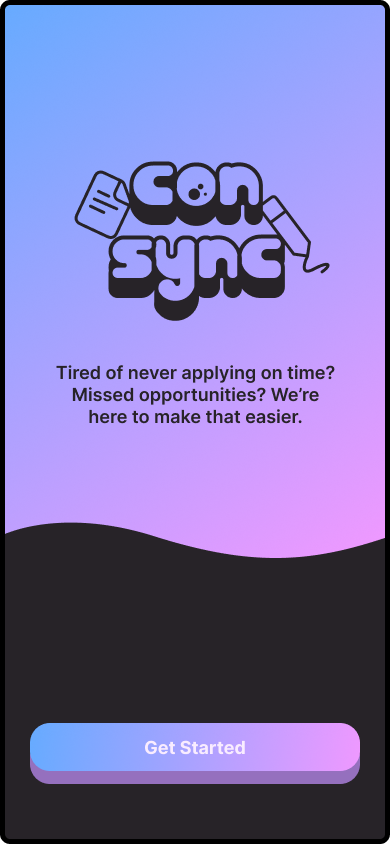
An app that helps small business artists stay on top of event applications with ease. Get timely notifications, avoid missed deadlines, and discover new opportunities—all in a simple, stress-free way.
Overview
While small art businesses are on the rise, they are constantly seeking income beyond commissions and online sales. Events like conventions related to pop culture (anime, comics, etc.) are a key source of their revenue, helping them grow their audience, and connect with others in the community.
However, artists often struggle to track event application dates and find the right opportunities, especially newer artists. Many miss deadlines or get lost in outdated, cluttered websites. My goal is to offer a solution that helps artists easily track events and access applications without the frustration of sifting through unnecessary information.
UX/UI Designer
ROLE
TOOLS
Figma
TIMELINE
1 Month
Table of Contents
| COMPETITIVE ANALYSIS
Research Findings
Below are a few samples of strengths and weaknesses I discovered during my competitive analysis research.
ANIMECONS.COM
Popular resource used amongst artists and attendees to track any convention based on year and country.
Global Tracker
A global list for upcoming and past conventions that provides information and incoming guests.
Global List of Conventions
Artists searching for conventions in their state often have to do a little digging to find specific events.
Limited Filter System
Information on conventions, articles, blogs, and announcements are not up to date.
Outdated Information
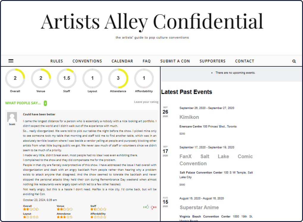
Review System
A resource for artists and helpers to leave a review on their vendor experience.
Calendar Tracker
Tracks conventions occurring each month, although convention dates are innacurate.
Outdated Design
Site is not up to date with current design trends, and comes off as unreliable.
Not Enough Traction
Event reviews appear unreliable and may discourage artists from trusting posts by other users.
Upcoming Conventions
Provides a list of upcoming conventions on the home page with dates and direct hyperlinks.
Worldwide Map
Offers a global interactive map that allows users to explore and locate conventions.
Potential Threats
The site contains ads that may harm users with risks for scams and malware.
Unclear Filters
Finding specific conventions is challenging, as users must scroll to the bottom of the list to access filters.
Artist Alley Confidential
UpcomingCons
| USER INTERVIEWS
What Problems Are Artists Facing?
User interviews were conducted with 7 participants ranging from experienced to newer artists. My goal is to gain insights on their pain points, stressors, and overall experiences when looking and applying for artist alley tables at conventions.
Problem Statement
The most common pain point newer and experienced artists face is not having a reliable source to manage planned events, share their experiences, and access up-to-date event information.
“How might we develop an app for artists to discover, track, and apply to events all at once?”
| PERSONAS
Understanding the User
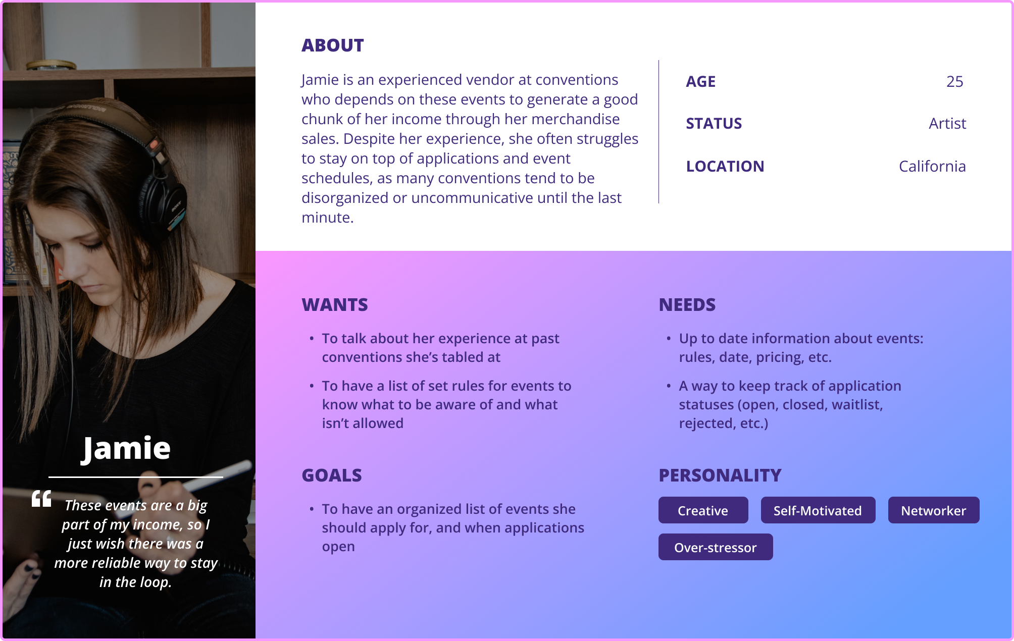
Personas were created based on experiences gathered from newer and experienced artists during user interviews. This helped me understand their frustrations, what they want, and what they need.
“Sometimes the convention staff don’t make it easy to know when applications open.”
— Jamie, Experienced Art Vendor
“It’s intimidating to apply for bigger events, and trying to find events to even apply for.”
— Lindsey, New Artist
| USER FLOWS
User Journey
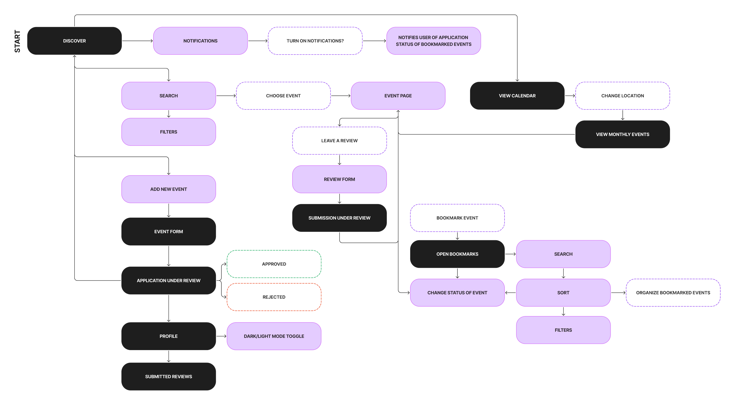
Before beginning the wireframing process, I created user flows, task flows, and a sitemap to build the app's structure. My goal is to outline each feature, define how user’s would navigate through the app, and identify potential roadblocks.
User Flow & Task Flows
I wanted to understand how the user would approach each task, and what potential roadblocks they would encounter.
Site Mapping
I created a site map to plan out what types of features to include and address what artists needed based on insights from user interviews. I also referred back to my competitive analysis to see what users preferred and tend to avoid.
| LOW & MID-FIDELITY WIREFRAMES
Visualizing the User Flow
Low-Fidelity
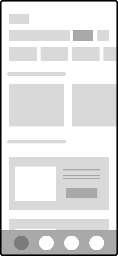
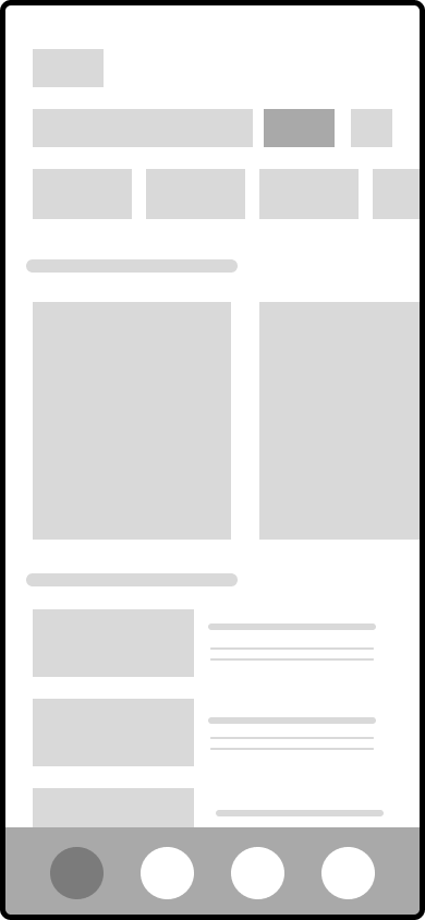
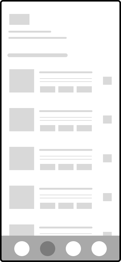
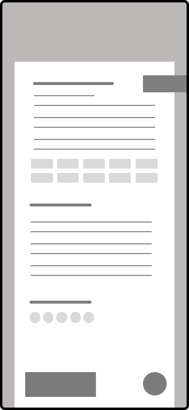
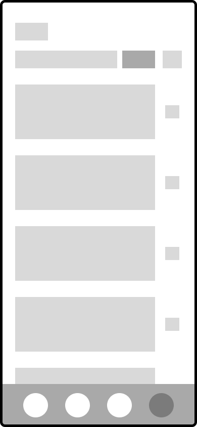
I sketched out low fidelity wireframes using the user and task flows as a reference, and translated those sketches into draft screens in Figma.
Mid-Fidelity
After establishing the foundation, I refined the wireframes to mid-fidelity and tested the prototype with artists from user interviews to ensure a clear, intuitive flow. These tests helped identify navigation issues, and potential pain points.
| BRANDING
Brand Development
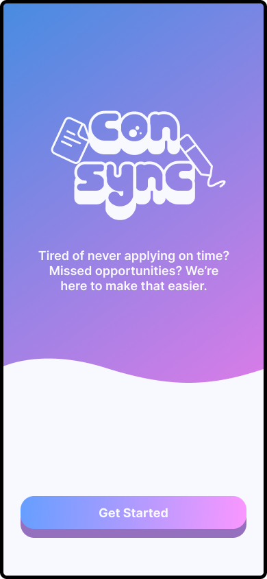
I selected a color palette of pink, purple, and blue to convey creativity, reliability, and trust. The name “ConSync,” short for Convention Sync, highlights the app’s ability to streamline and synchronize the ability to track, discover, and apply to cons all at once.
Style Tile
UI Kit
| DESIGN SYSTEM LIBRARY
Organizing Components
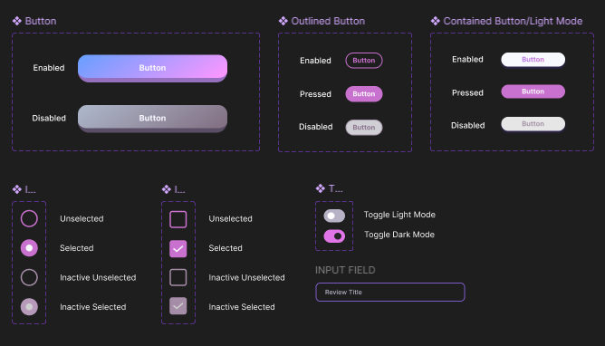
After refining the wireframes based on user feedback, I developed and maintained a comprehensive design system library to ensure consistency, scalability, and efficiency. Using atomic design methodology, I created reusable components and design patterns, breaking down the main wireframes into structured, manageable elements.
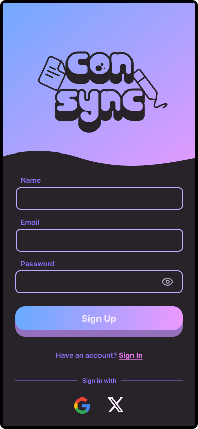
I followed WCAG color guidelines and used a contrast checker to ensure accessible color combinations. To enhance the user experience, I took on the challenge of designing a dark mode theme, giving users more customization options while keeping the brand consistent across both light and dark modes.
| HIGH-FIDELITY WIREFRAMES
Implementing Visual Design
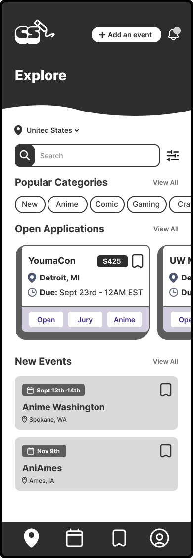
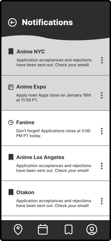
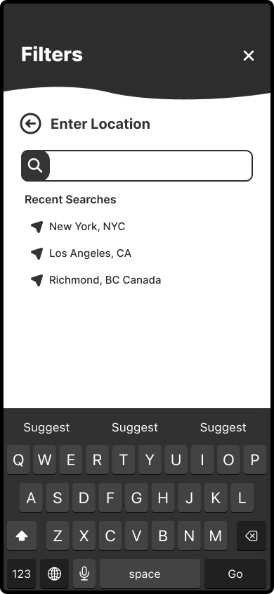
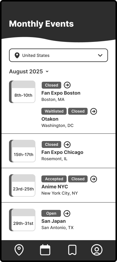
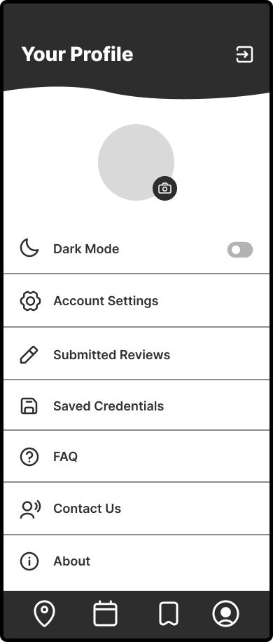
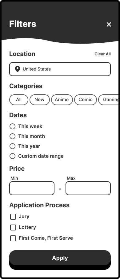
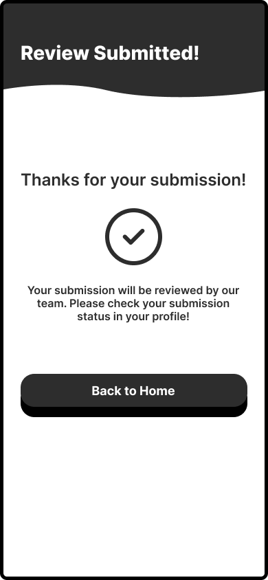
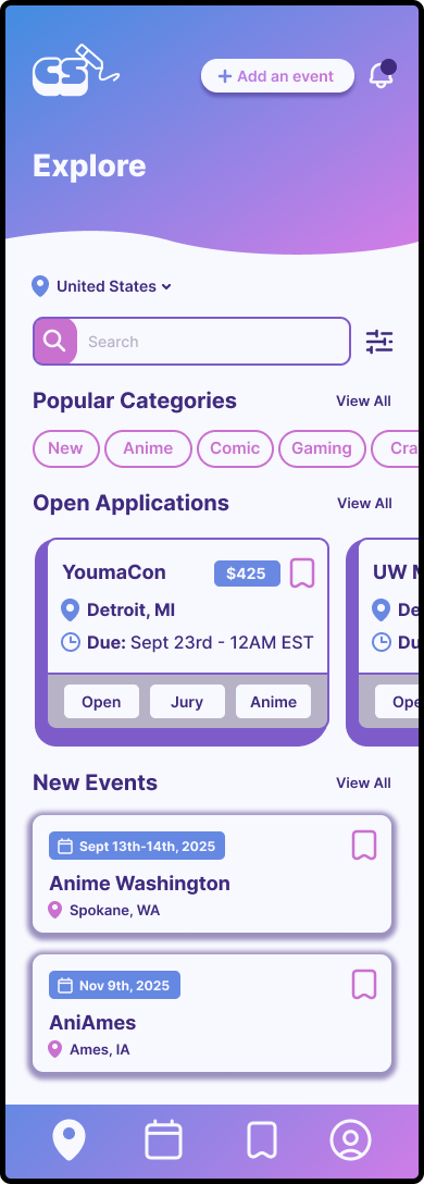
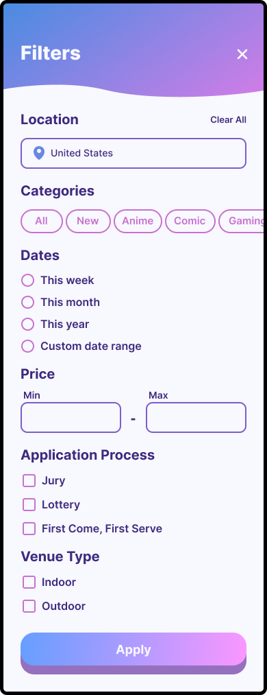
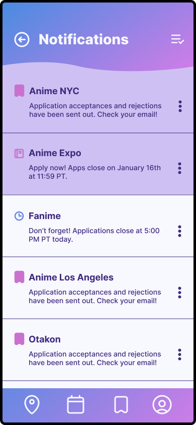
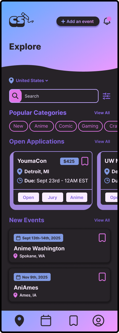
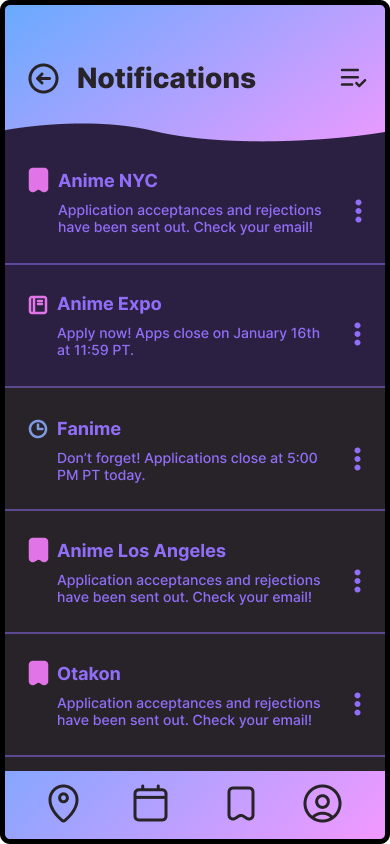
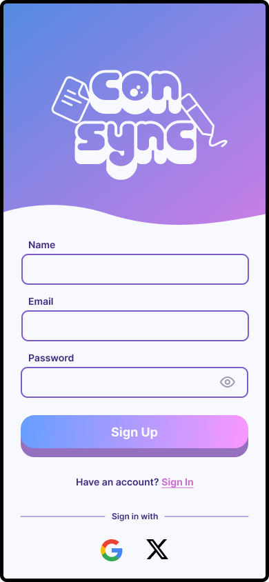
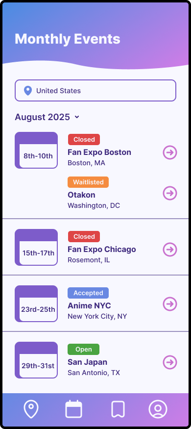
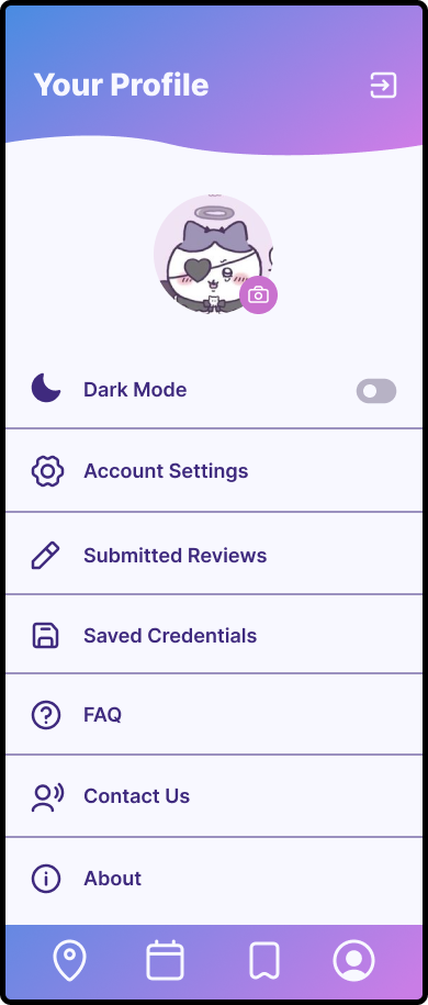
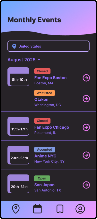
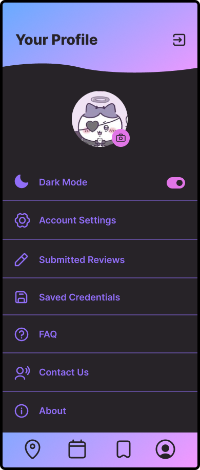
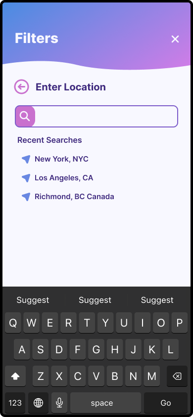
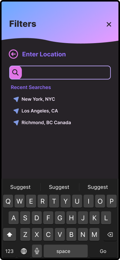
After making minor adjustments from early user testing, I applied the app's branding and visual design, featuring clean, modern typography. I focused on refining the user flow and enhancing the visual hierarchy.
LIGHT MODE
DARK MODE
| USER TESTING
Gathering Actionable Feedback
I conducted user testing with 8 participants, varying from newer to experienced artists. They were instructed to complete 3 tasks:
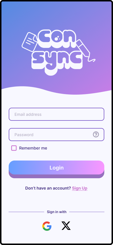
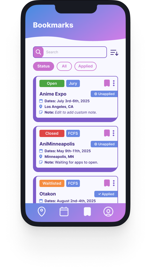
Sign in or Sign Up and Bookmark an Event
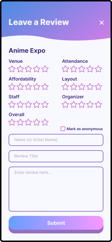
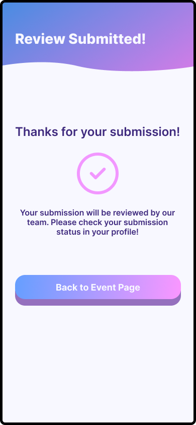
Leave a Review on an Event
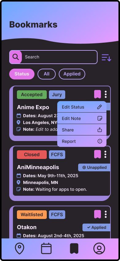
Change the status of a Bookmarked Event
Bonus: Explore and complete tasks in Dark Mode
Test Objectives
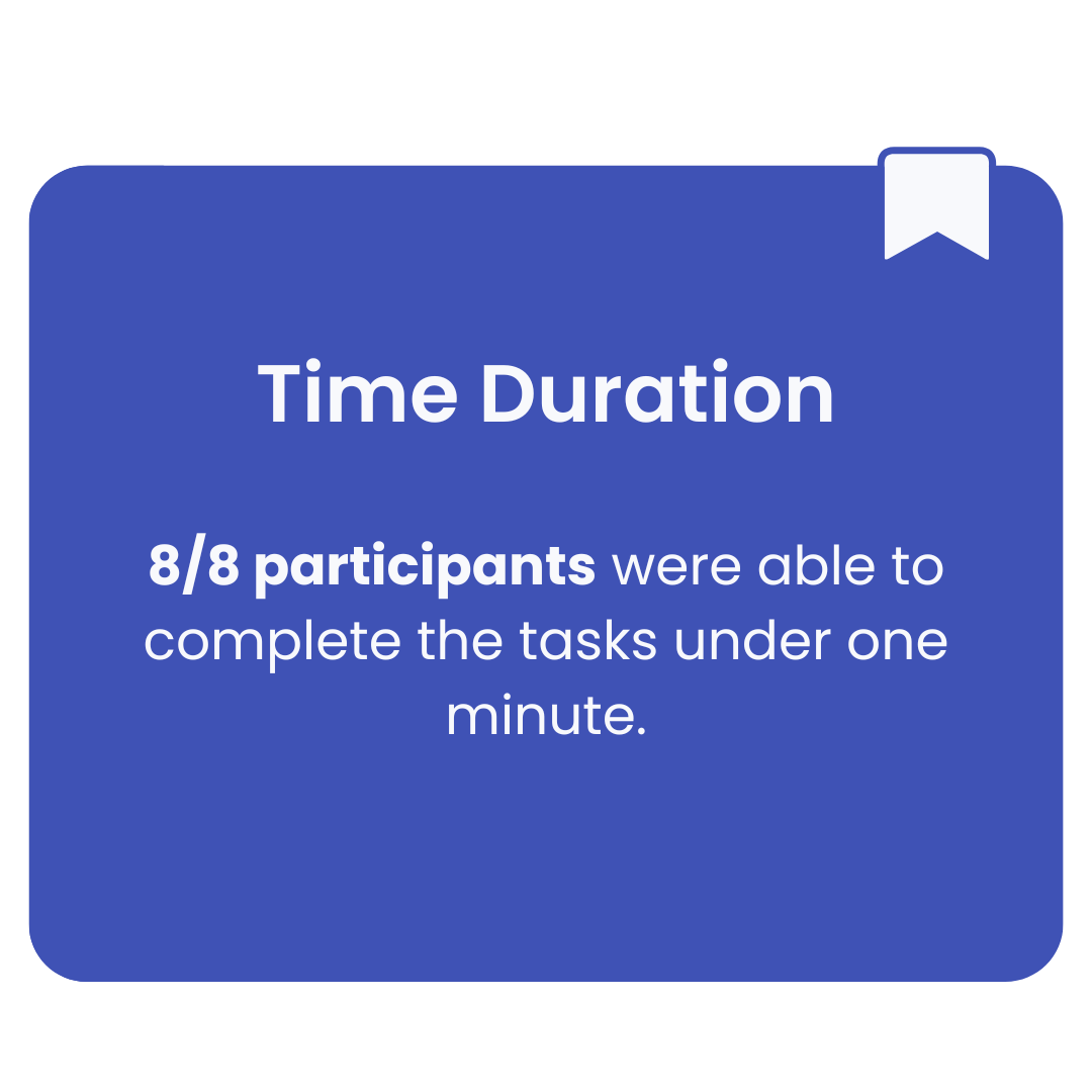
Time Duration
The amount of time it took to complete tasks in a timely manner. Task completion would ideally take less than a minute.
Navigation
Navigating the entire app beyond instructed tasks without anything confusing along the way.
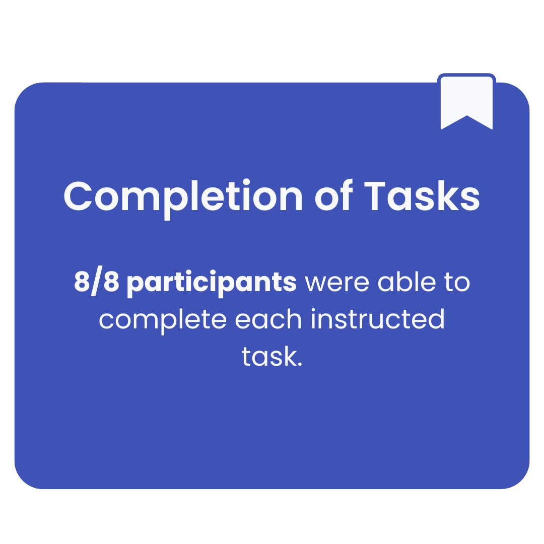
Completion of Tasks
Completing tasks without any problems. Were there any confusing parts?
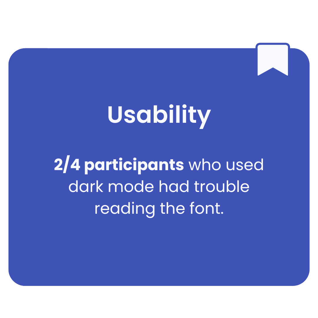
Usability
Is the entire app easy for the user to understand? Are they familiar with each action?
Test Results
| ITERATIONS
Listen, Learn, Refine
Although users completed the assigned tasks in under a minute, I noticed areas that still needed improvement. In addition to the main iterations, I made minor design adjustments to accommodate both light and dark modes. Below are the changes I prioritized based on user feedback.
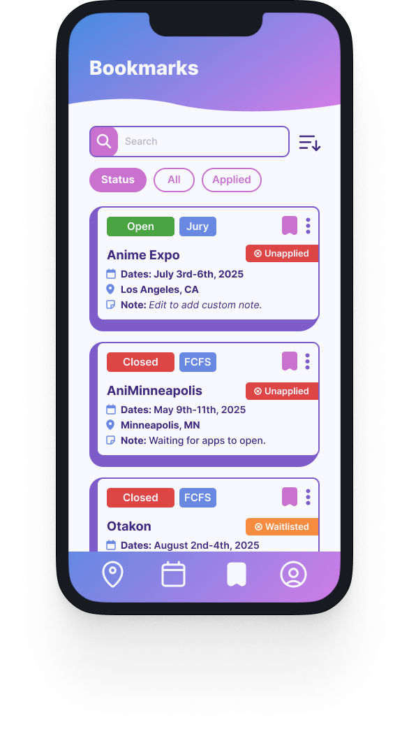
Event Status
Pain Point
When asked to change the status of a bookmarked event, users were confused since the statuses were inconsistent with the event status and their own status.
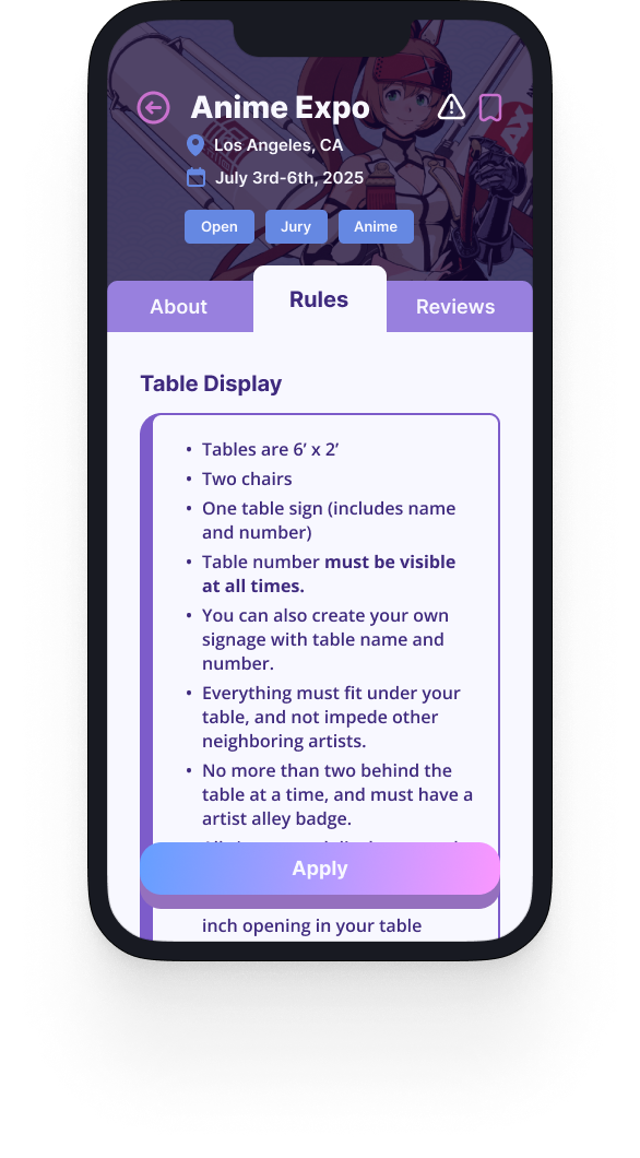
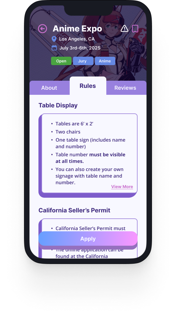
Wall of Text
Pain Point
Users found it frustrating to scroll through lengthy blocks of text for rules, stating it was tedious to search for specific information, especially after browsing multiple events.
Dark Mode
Pain Point
Users had a hard time reading the purple font in dark mode. They mentioned it kept blending into the background.
Solution
Updated the statuses for accepted, waitlisted, and similar categories in the appropriate section to match the task flow instructions, and color bars due to popular demand.
Solution
Cards are now collapsible, allowing users to expand or minimize. Users can now add and edit bookmark statuses on the event page after bookmarking.
Solution
Adjusted the color, saturation, and brightness to enhance readability and distinguish the headers from regular text.
The Final Product


