| RESPONSIVE WEB DESIGN
JESSICA’S DOODLES
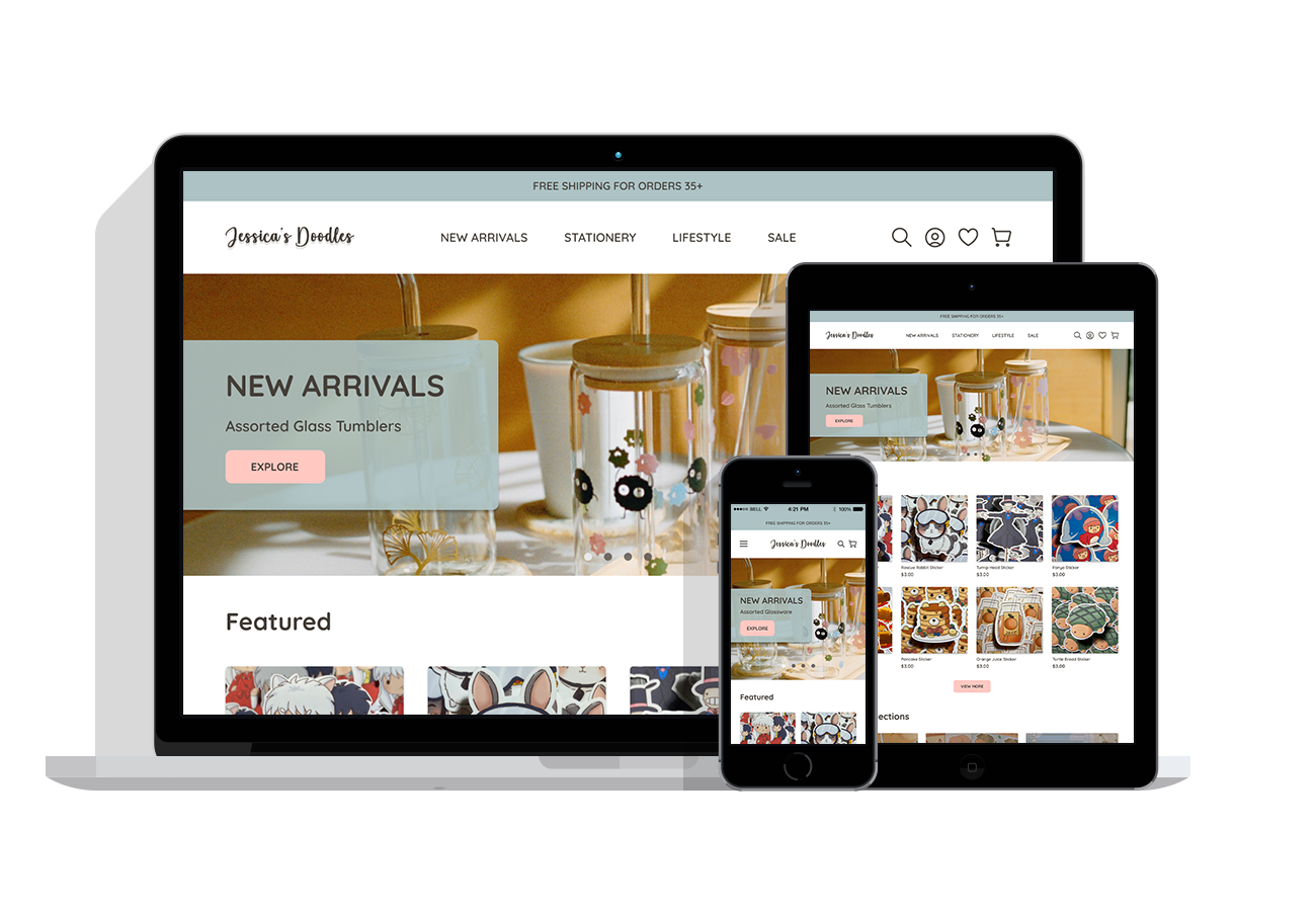
Collaborated with a client who is an artist to design a responsive online shop aligning with her branding, following her goals and needs.
Overview
Jessica is a small business owner who illustrates and creates merchandise to sell at conventions, local events, and online stores, specifically Etsy. She sells a variety of handmade goods ranging from stickers, stationary, glassware, and various crochet items.
As an Etsy seller, she faces high fees on transactions, listings, and shipping, making it difficult to avoid increased costs to her customers. She wants a professional, standalone shop to guide customers directly, free from third-party fees and limitations, and to make her website more personable to her branding. My goal is to understand what customers look for in an online shop and design an intuitive site that reflects the artist's branding.
ROLE
UX/UI Designer
TOOLS
Figma
TIMELINE
1 Month
Table of Contents
| COMPETITIVE ANALYSIS
Research Findings
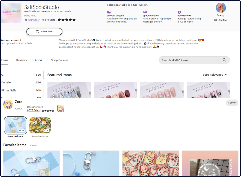
Below are a few samples of strengths and weaknesses I discovered during my competitive analysis research.
Etsy
Mercari
Amazon Handmade
Ko-Fi
Niche Audience
Etsy connects artists with customers who value handmade, creative goods.
Analytic Insights
Tracks data of shop performance, sales, and what specific items customers are looking at.
Accumulating Fees
Shipping, Etsy fees, and charges increase item costs, causing customers to choose cheaper alternatives.
Limited Brand Identity
Customization of profile, and promoting art brand is limited to only a profile picture and banner.
Prepaid Shipping Labels
Provides sellers prepaid shipping labels and discounted rates for smoother transactions.
No Listing Fees
Sellers can list an unlimited amount of items without paying listing fees, making it cost-effective to sell.
Low Traffic for Niche Product
Hard to sell handmade products since customers are looking to buy resale items from certain brands.
Unauthentic Products
Customers have to check sellers reviews and ratings to avoid being scammed or given a fake product.
Large Audience
Sellers benefits from Amazon’s reputation reaching a large global audience.
Fast Shipping Guarenteed
Sellers can offer Prime shipping if they are part of the FBA program, increasing visibility.
Performance-Driven Algorithm
The search algorithm favors popular items, making it hard for new handmade products to gain visibility.
Not Beginner Friendly
Small businesses will not benefit right away due to high competition, and
Transparent Funding
Supporters can see how their money is used, building trust between the artist and their audience.
Commission Friendly
Allows artists and content creators to offer art commissions or digital goods to their audiences.
Limited Discovery
Difficult to find profiles without a direct link from their social media, or other sites.
No Physical Goods
Selling physical items will be difficult due to lack of visibility, but it’s ideal for art commissions.
| USER INTERVIEWS & AFFINITY MAPPING
What Problems Are Consumers Facing?
User interviews were conducted with 7 participants specifically customers who have shopped on third party sites vs. artist’s online shops. I had a separate interview with the artist to learn about her experiences and the challenges she faced using a third-party site as a seller.
Affinity Mapping
I created an affinity map to highlight common patterns and pain points from each of the individuals I interviewed, including the artist. After compiling and organizing the pain points from each interview, I created a list of common patterns and takeaways.
Problem Statement
Small art businesses need a way to cut costs and boost their branding since they're busy keeping up with trends and creating new products.
“How might we help small art businesses market themselves and enhance their brand while providing consumers with a secure, efficient shopping experience?”
| PERSONAS
Understanding the User
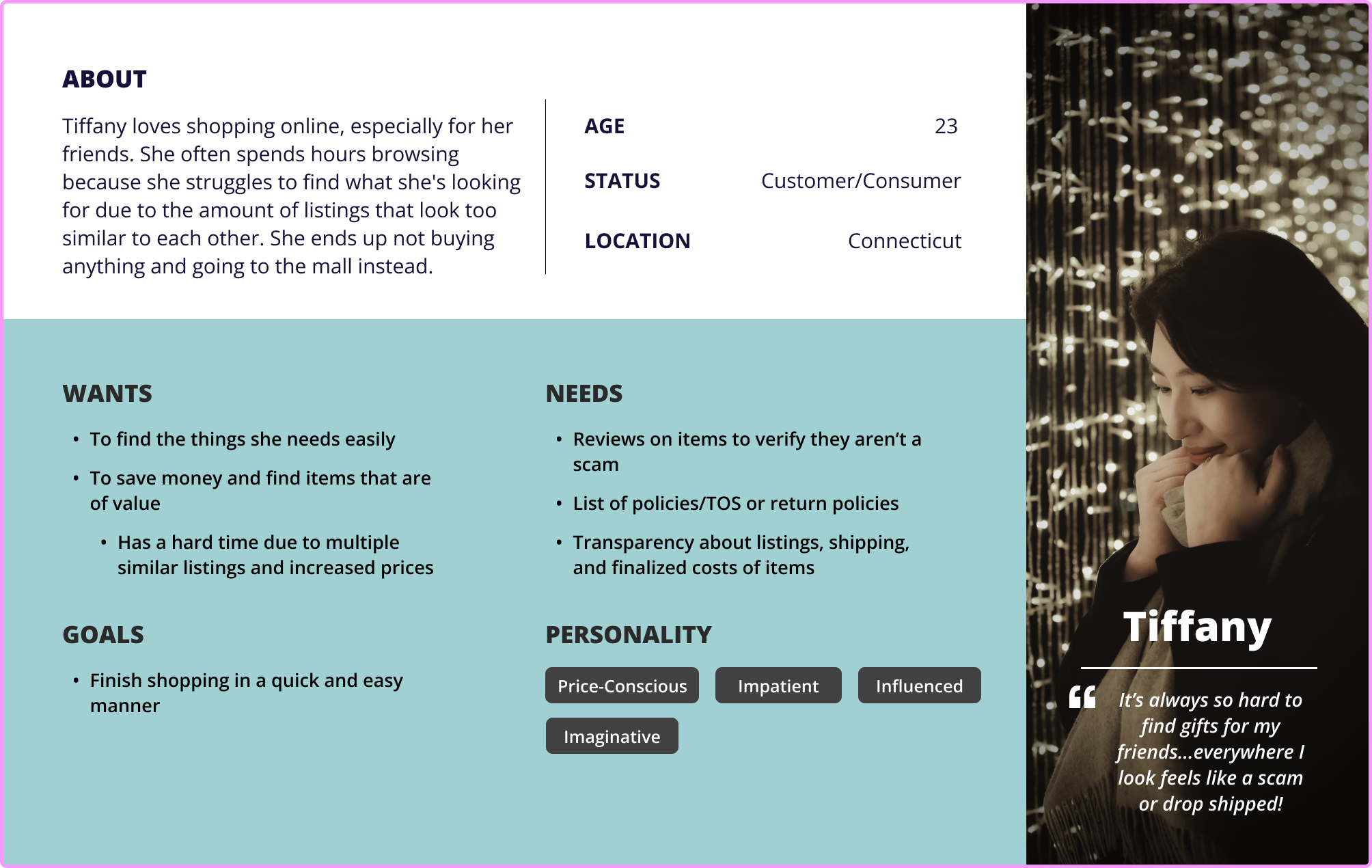
Personas were created using insights collected from user interviews, reflecting both the artist's and the customer's perspectives.
“A lot of the 'handmade' items are just things you find on other sites.”
— Tiffany, Consumer
Feature Set
A set of features was created with the artist to identify which elements should be prioritized on the site and which can be addressed at a later stage.
Must Have
Secure Payment Options
Multiple payment methods, including credit cards, Paypal, and other trusted payment gateways.
Shipping & Return Policies
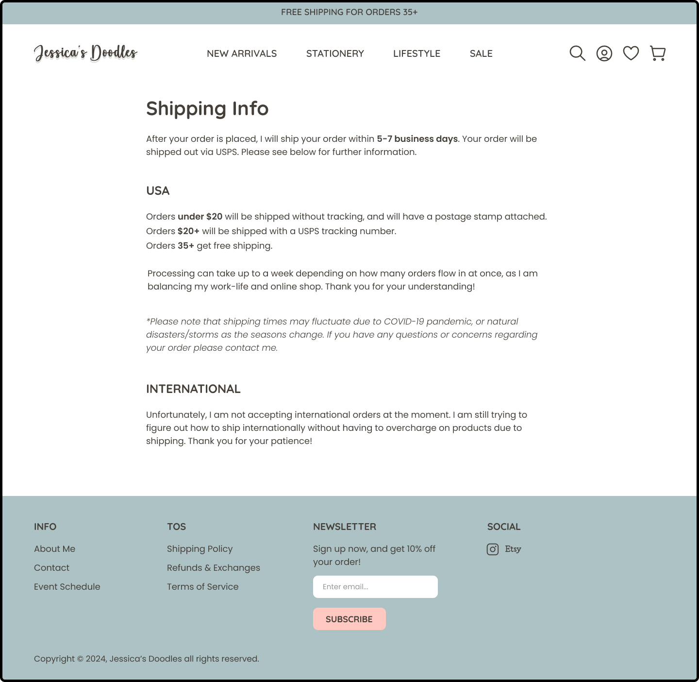
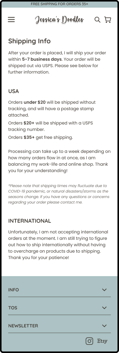
Clear information on shipping costs, delivery times, and return policies.
Review System
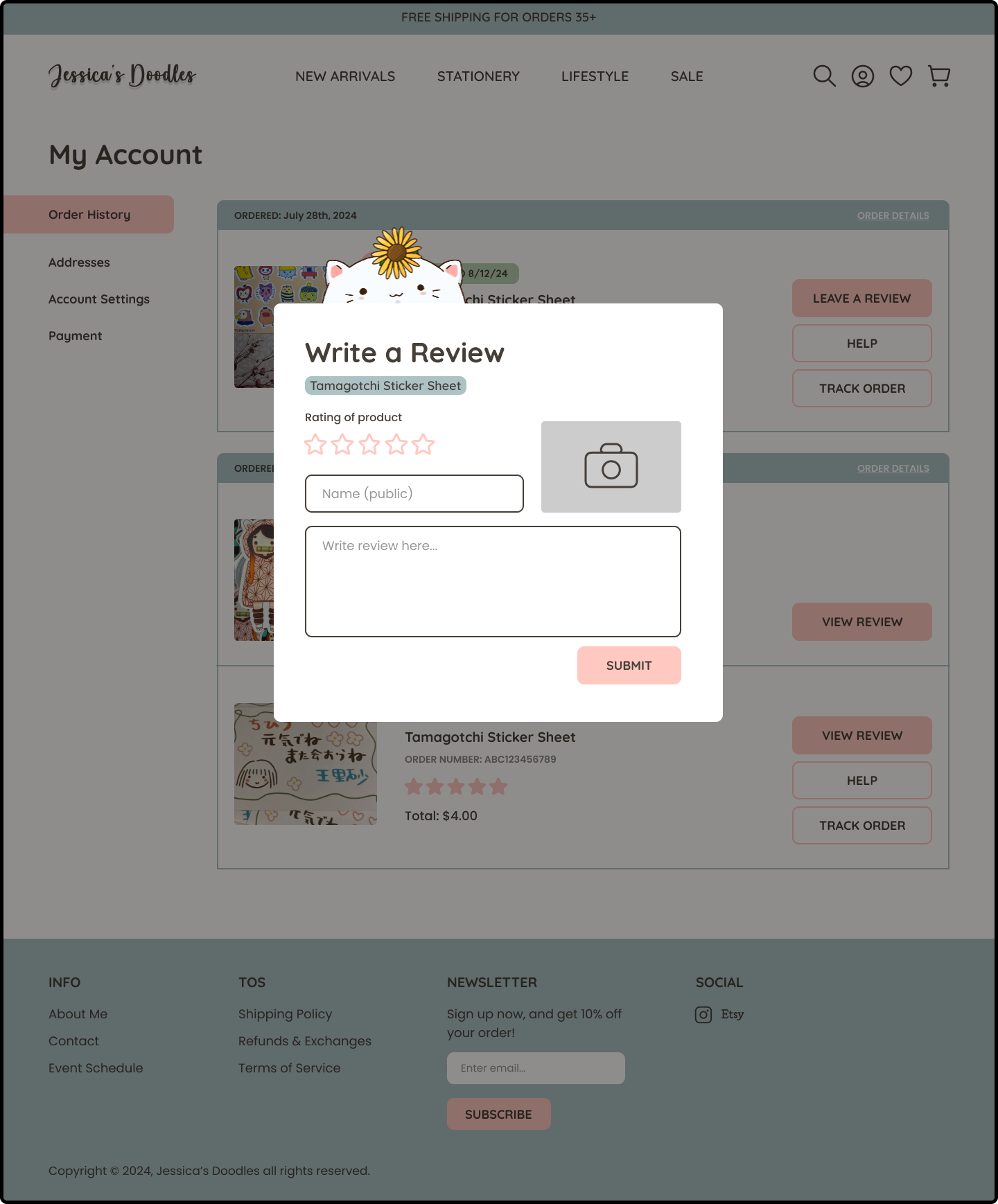
Allows customers to come back and review products, and give their honest feedback.
Newsletter Signup
Customers can subscribe to updates, promotions, sales, and artist announcements.
Easy Checkout
Simplified and streamlined checkout process to reduce cart abandonment.
Customer Support
Direct support via chat, email, or the artist's preferred contact method.
Later Additions
“A personalized website truly showcases an artist's vision in a way platforms like Etsy can't.”
— Jake, Small Business Artist
Custom Orders
The ability to request custom merchandise or art commissions.
Artist Profile
A section showcasing the artist's bio, portfolio, and journey.
FAQs
Provides a list of frequently asked questions from new and returning customers.
Freebies
Letting customers know they will receive free merchandise with their order, or a special gift.
| USER FLOWS
User & Task Flows
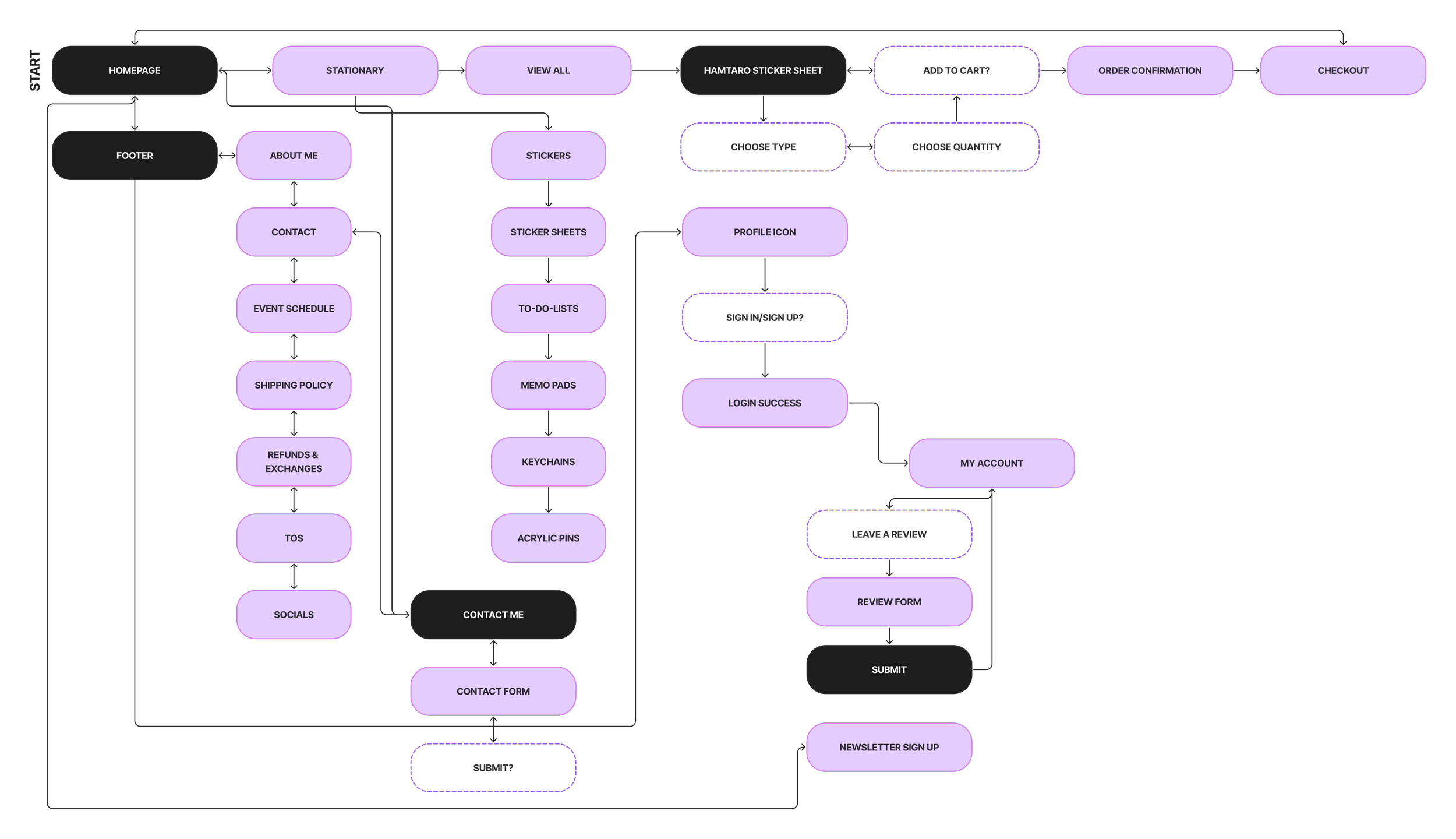
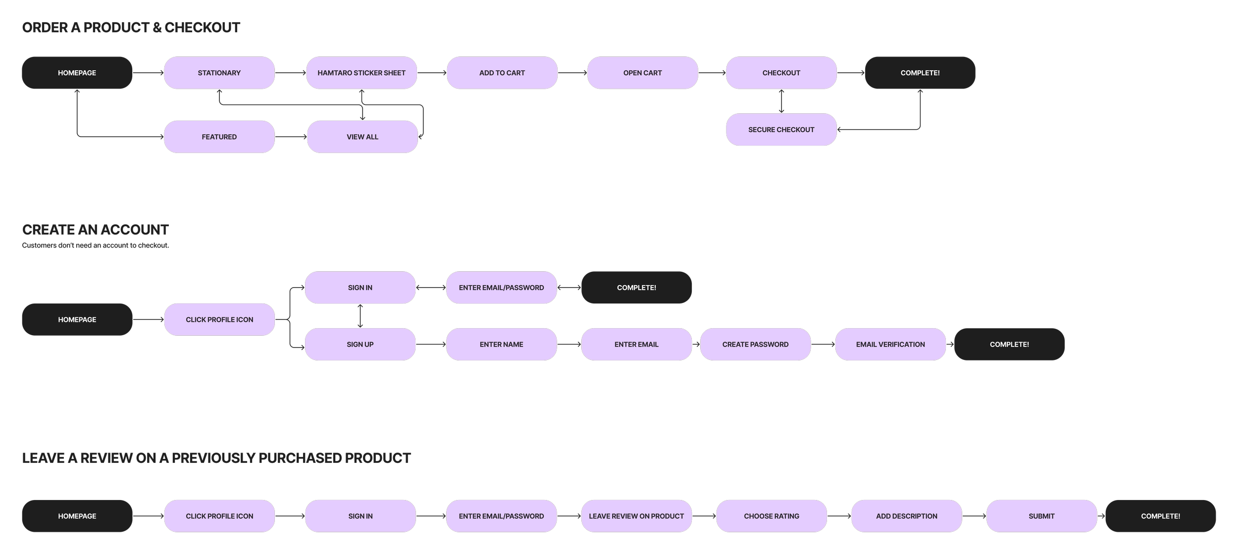
Before beginning the wireframing process, I created user flows and task flows to map out how users would navigate the site. My goal is to outline each feature, define how user’s would navigate through the site, and identify potential roadblocks.
| LOW & MID-FIDELITY WIREFRAMES
Visualizing the User Flow
Low-Fidelity
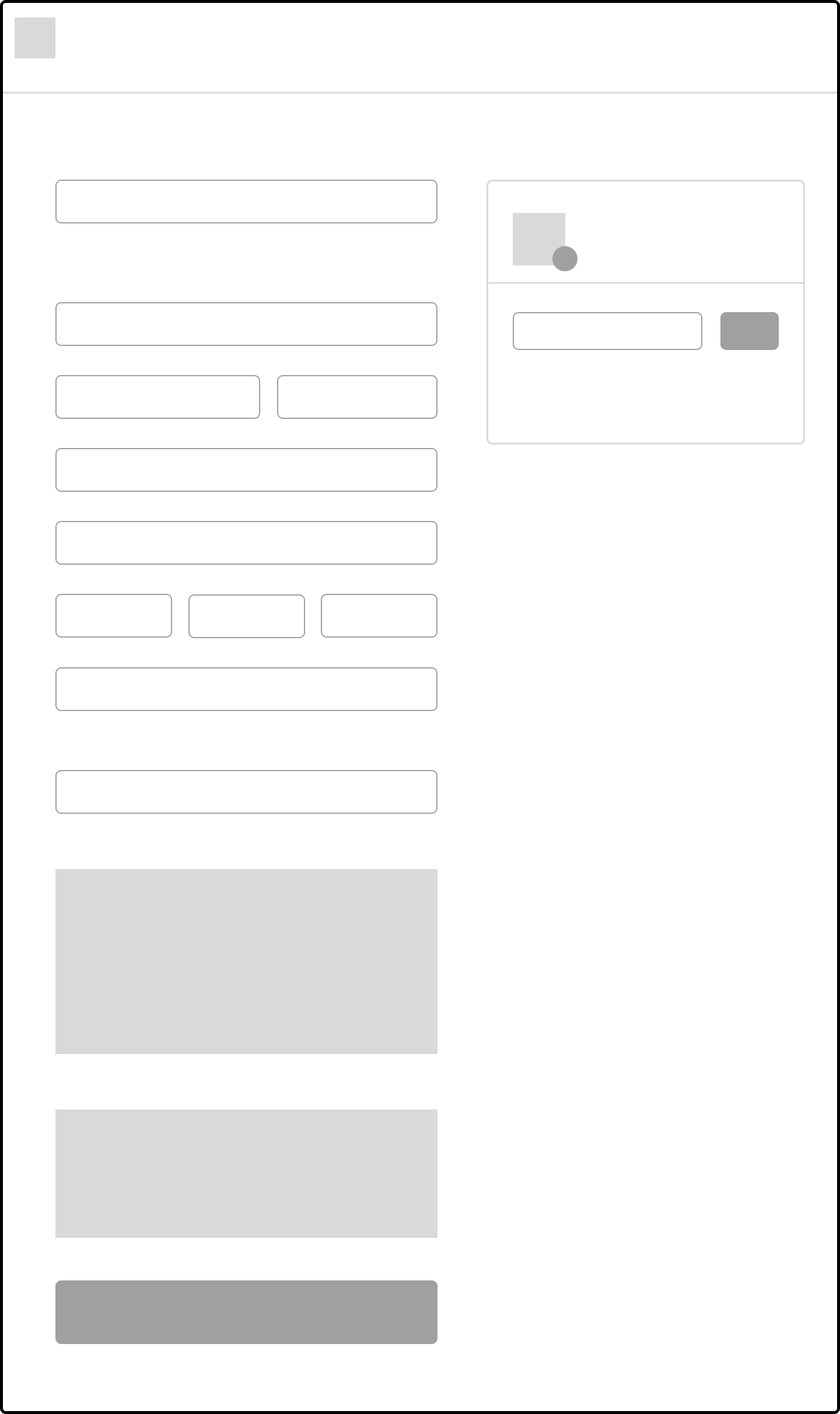
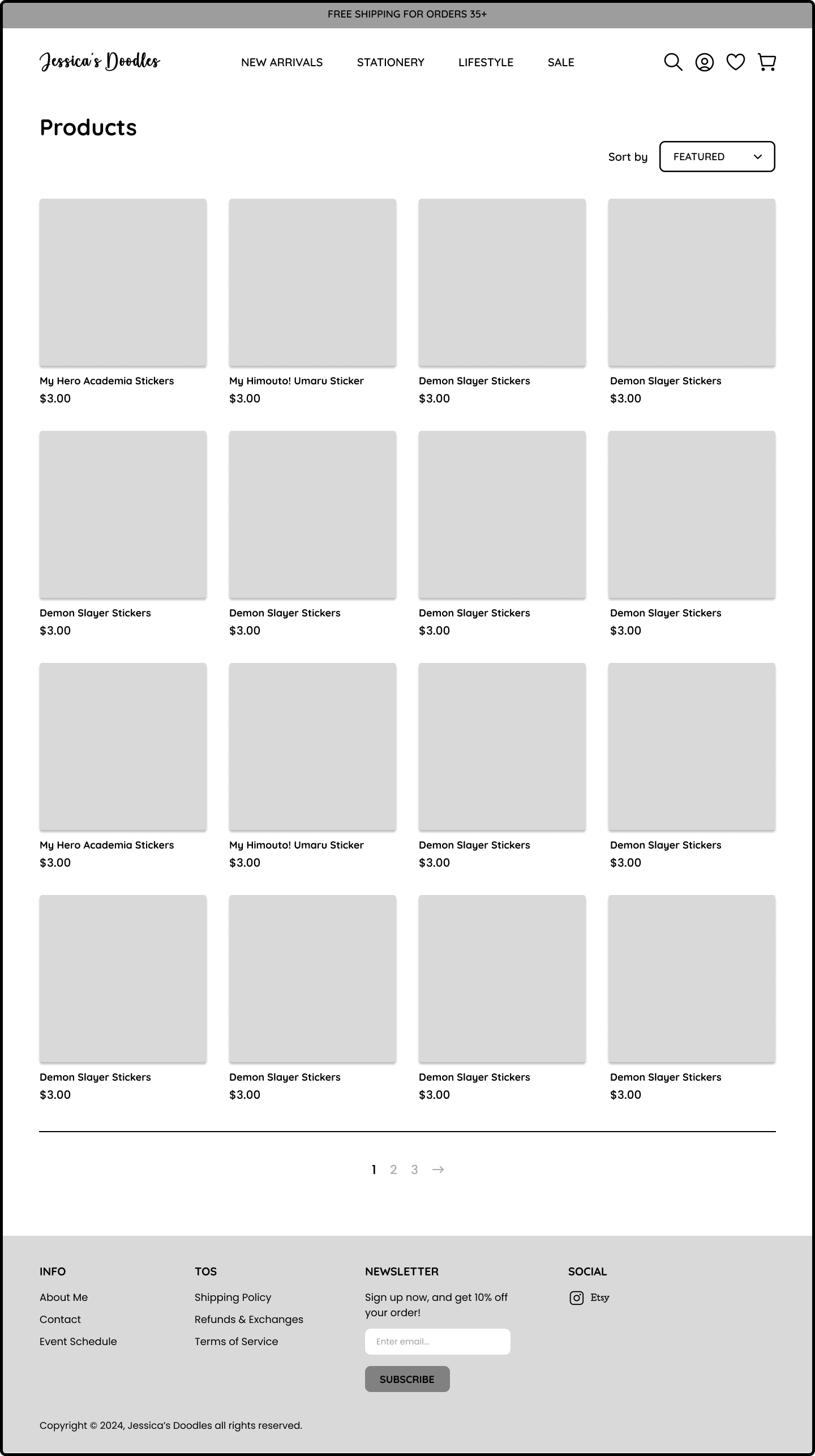
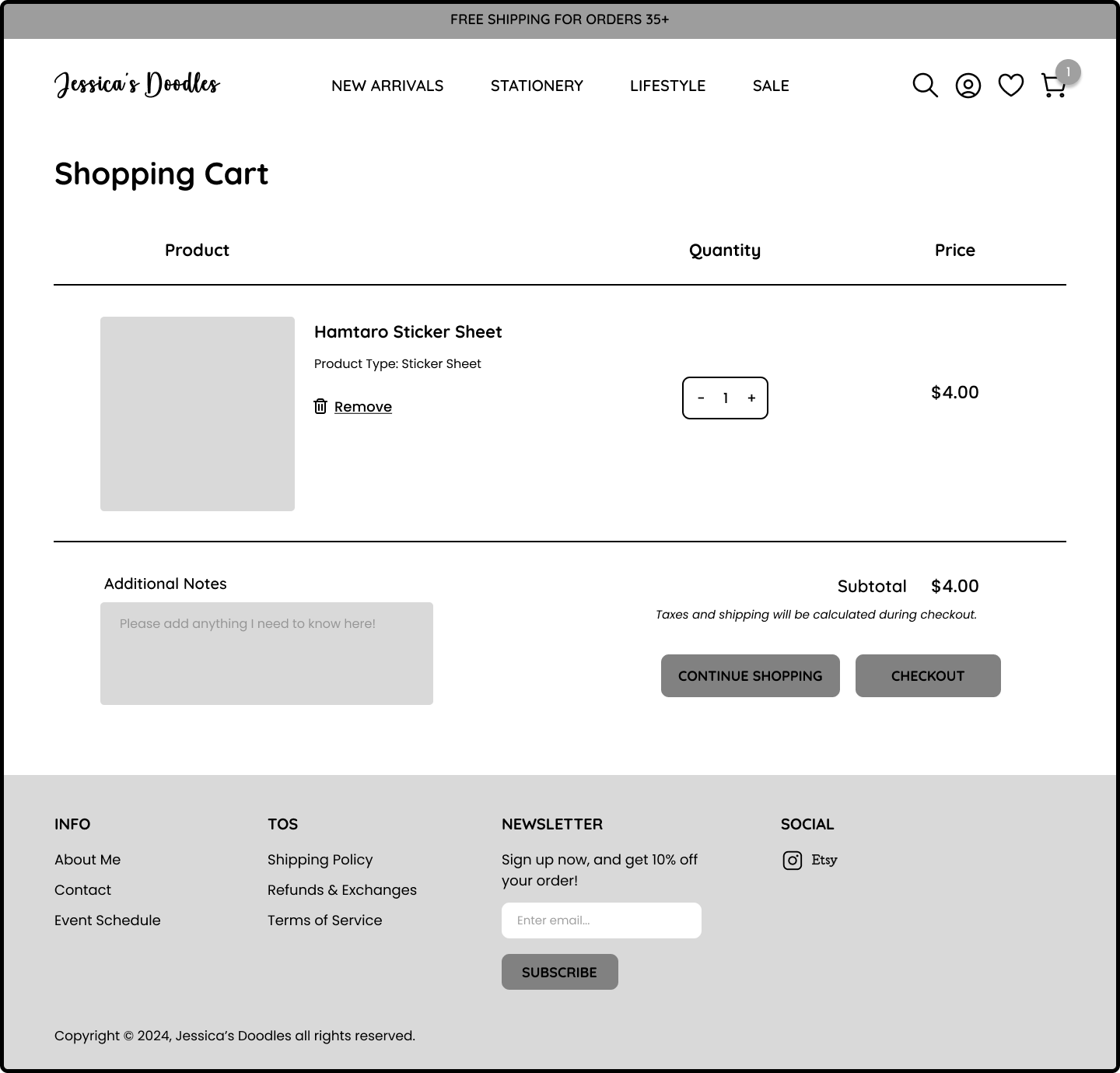
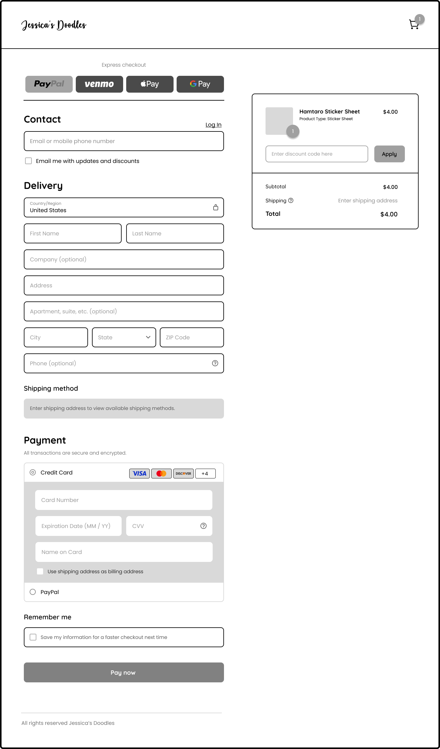
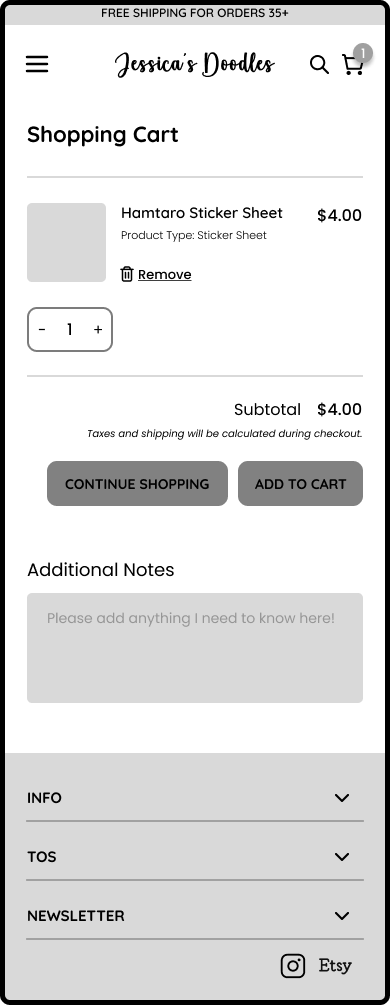
I sketched out low fidelity wireframes for both mobile and desktop prototypes using the user flows and task flows as a reference, and translated those sketches into draft screens in Figma.
Mid-Fidelity
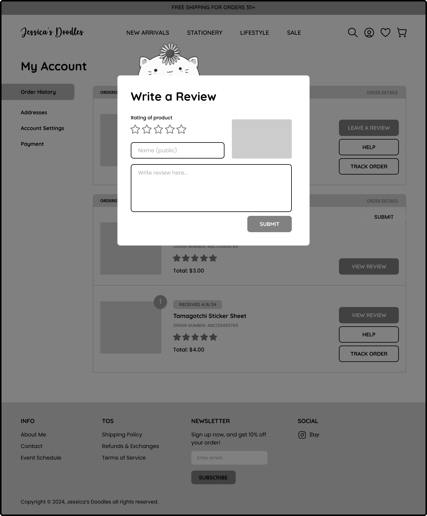
After establishing the foundation, I refined the wireframes to mid-fidelity and tested the prototype with participants from user interviews to ensure a clear, intuitive flow. These tests helped identify navigation issues, and potential pain points. I added assets provided by the artist per her request.
| BRANDING
Branding
The artist had a clear branding vision in mind, including pre-selected fonts. I advised against using cursive fonts throughout the entire site, as it could hinder readability for users. Together, we collaborated to develop the style tile shown below.
| HIGH-FIDELITY WIREFRAMES
Implementing Visual Design
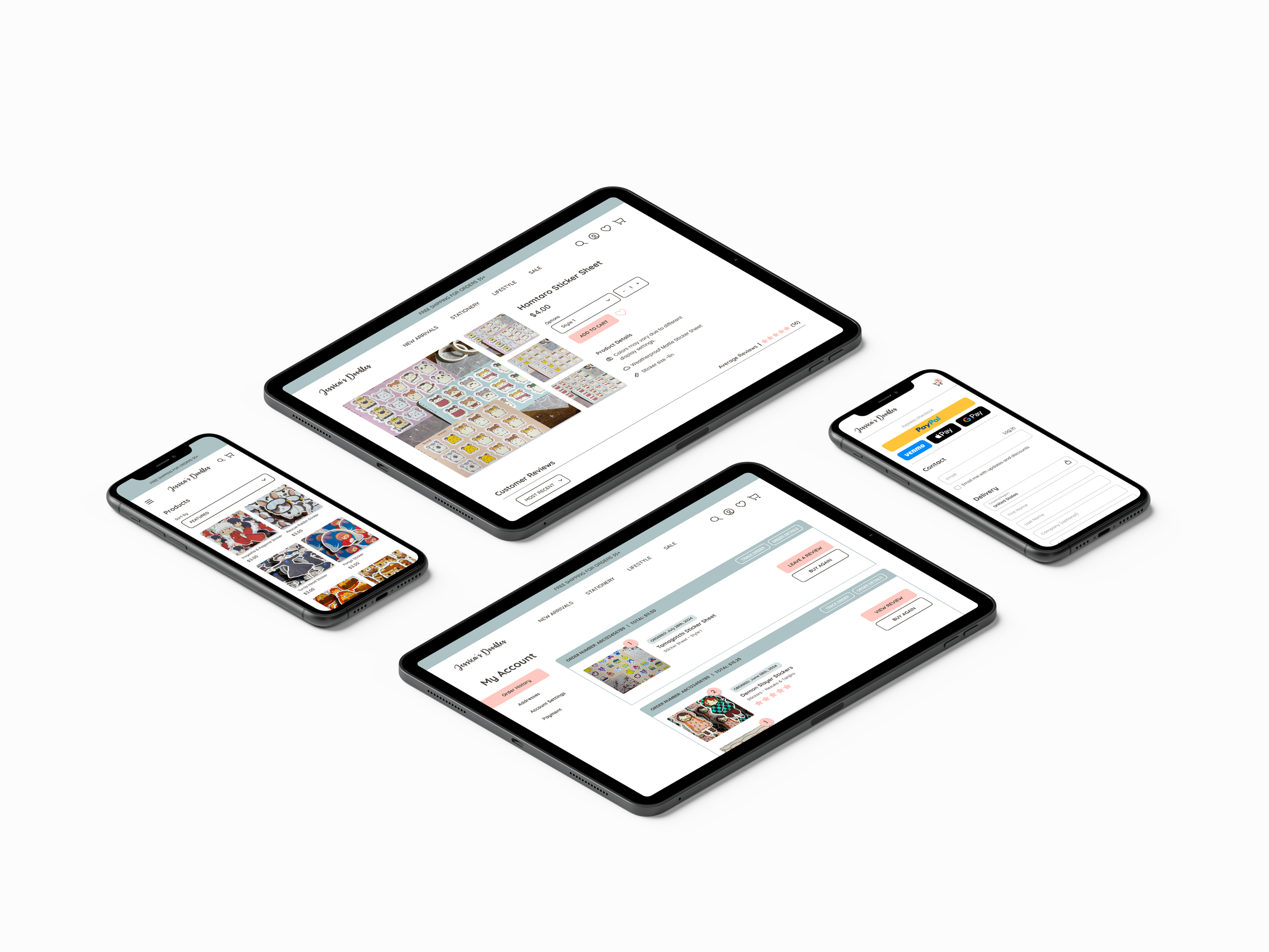
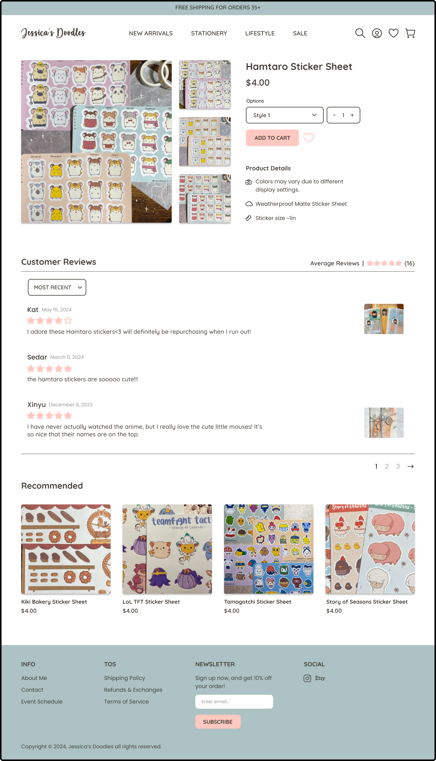
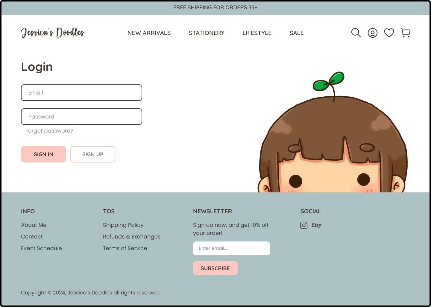
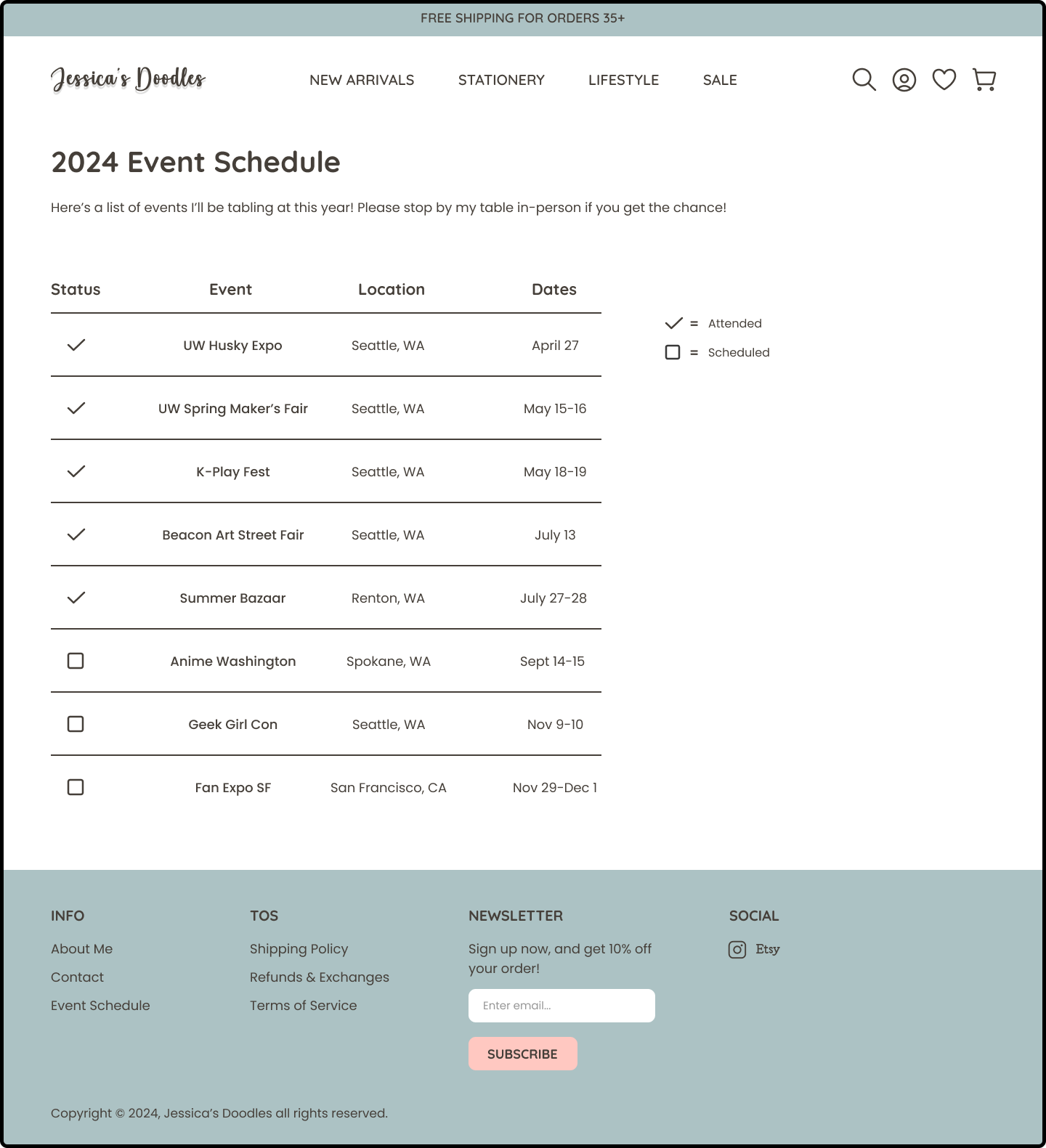
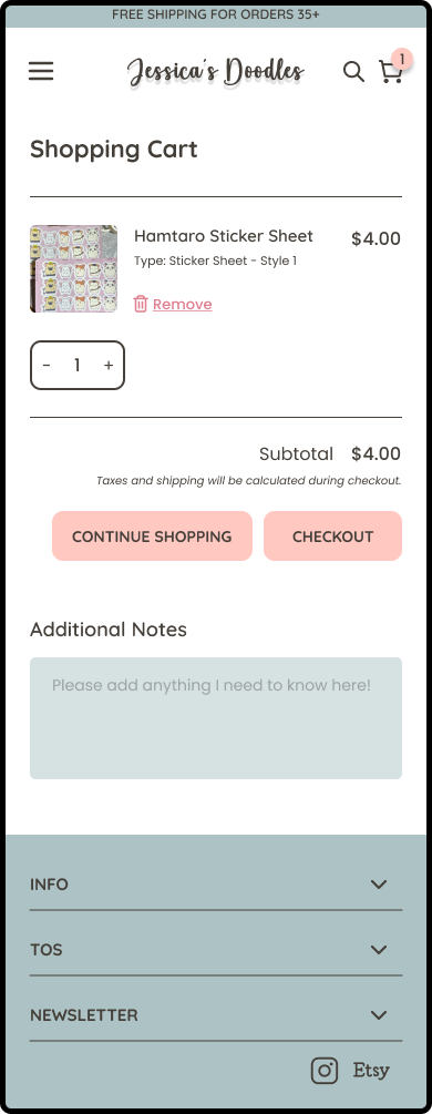
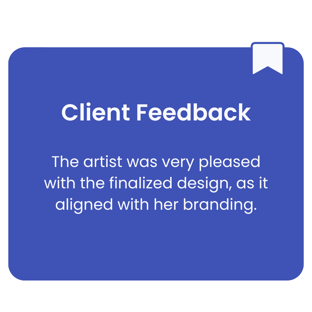
After making minor adjustments and discussing with the artist, I applied the sites branding and visual design. This process focused on refining the user flow and enhancing the visual hierarchy.
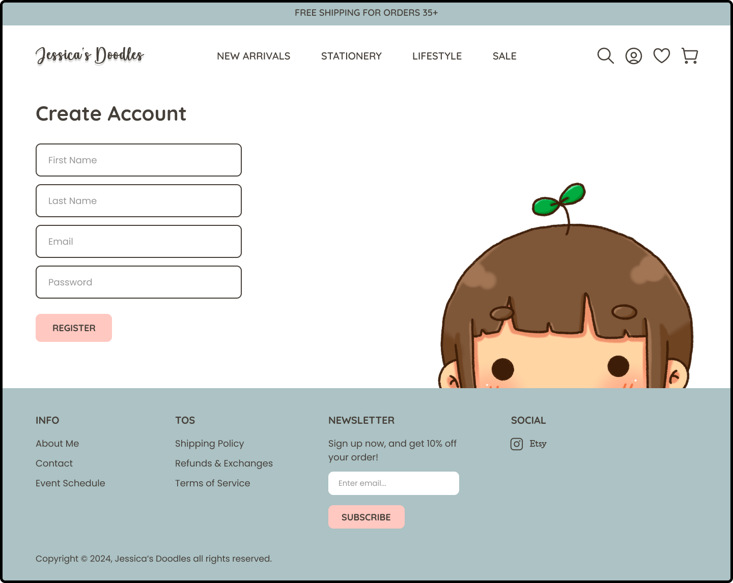
DESKTOP
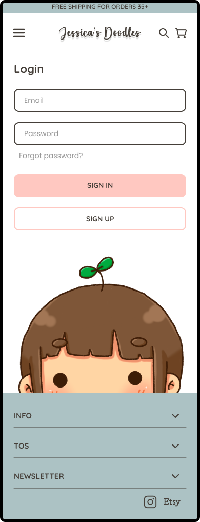
MOBILE
| USER TESTING
Gathering Actionable Feedback
I conducted user testing with 8 participants from user interviews during the research phase. They were instructed to complete 3 tasks:
Buy a Product & Checkout
Create an Account
Login and Review a Previously Purchased Product
Test Objectives
Time Duration
The amount of time it took to complete tasks in a timely manner. Task completion would ideally take less than a minute.
Navigation
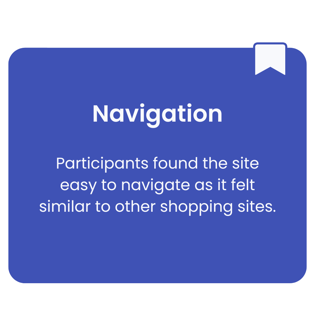
Navigating the entire site beyond instructed tasks without anything confusing along the way.
Completion of Tasks
Completing tasks without any problems. Were there any confusing parts?
Usability
Is the site easy for the user to understand? Are they familiar with each action?
Test Results
| ITERATIONS
Listen, Learn, Refine
While participants provided plenty of positive feedback, a few iterations were still necessary based on the artist’s input. Below are the changes I prioritized with her along with a few minor adjustments.
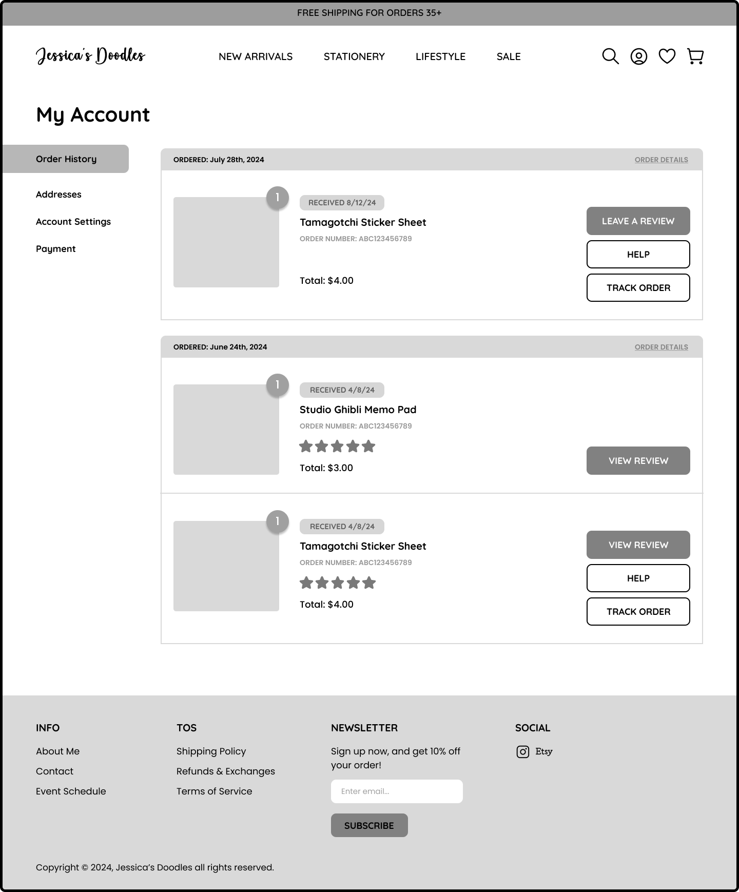
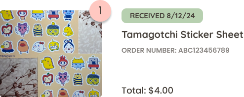
Order Status
Pain Point
“Received” status on purchase history was confusing, as customers wouldn’t know when a package will arrive. How would items without tracking be handled, especially those sent with just a postage stamp?
Button Placement
Pain Point
Tracking and help button placement was a bit confusing since it didn’t appear like it was referring to the entire order, only the individual item.
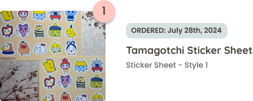
Solution
I removed the “Received” status, and replaced it with the order date to reduce confusion, per artist’s request. Added brief descriptions to past orders to specify the items included in each order.
Solution
Adjusted tracking and order details to the upper right, removed the separating line, and added the order number and total cost to the upper left. Added “Buy Again” button per artist’s request.
The Final Product

